About Analytic
Analytics helps you turn your Boxify business data into actionable insights — so you can make better decisions about sales, revenue, fulfilment, and payment trends.
1️⃣ What You Can Learn from Analytics
The Analytic Dashboard gives you a quick visual summary of key business performance data, including:
✔ Order status trends (new orders vs fulfilled vs pending)
✔ Daily sales performance
✔ Revenue received over time
✔ Monthly trends to assess performance patterns
✔ Customer payment behaviour
✔ Real-time comparisons within a selected date range
These insights help you answer questions such as:
🔎 Are my sales growing week-by-week?
🔎 Is revenue trending upward or downward?
🔎 Which dates have the most active orders?
🔎 Are payments mostly online or offline?
2️⃣ How to Access the Analytics Dashboard
Step 1: Go to Analytics from the menu on the left.
Step 2: Use the date filters to set a Start Date and End Date.
Step 3: Choose one of the available views:
- SUMMARY
- SALES
- MONTHLY
- SPECIAL
This lets you explore data from short periods (day/week) to longer time frames (monthly trends).
3️⃣ Dashboard Sections Explained
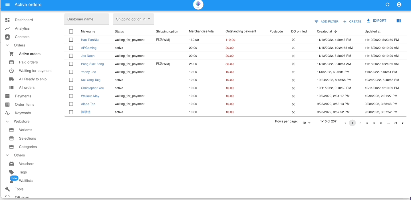
🔹 Summary
Order Status Summary
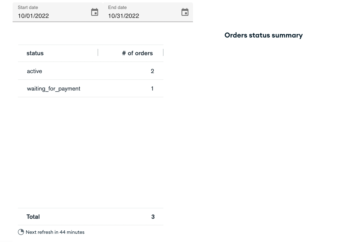
Shows the current count of orders in each status — giving you a snapshot of overall order health.
Use this to see whether most orders are being fulfilled promptly or still pending.
Number of payments
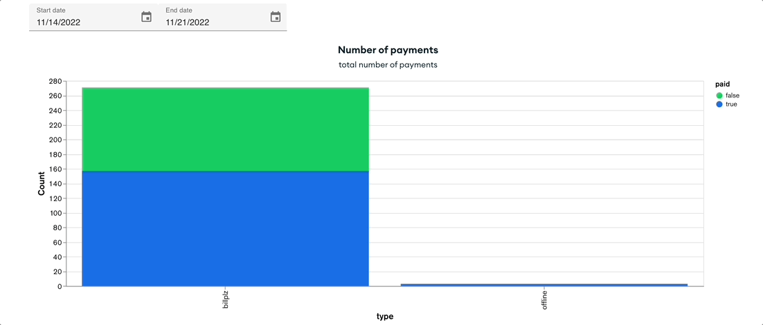
Compares online vs offline payments and shows whether payments have been reconciled.
- Green = unpaid / unreconciled
- Blue = paid / reconciled
This helps you understand whether most customers prefer online gateways or offline methods, and which need reconciliation action.
- To get the details of this chart, check out the Payments folder from the menu on the left.
⚠ Note
If your payment numbers appear lower than expected, please ensure:
- The item status has been toggled to Paid
- Payment has been reconciled properly
(Refer to: Payment Reconciliation Guide)
🔹 Sales Section
Daily Sales Chart
Displays total item sales per day based on selected date range.
This graph answers:
📊 Which day had the highest sales?
📊 Are sales trending upward over time?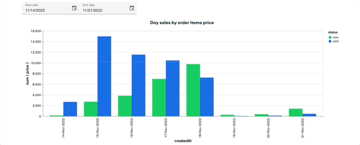
Sales Item Table
Shows item quantity sold and profit (if cost was entered at item setup).
This helps you:
✔ Identify top selling items
✔ Evaluate item-level performance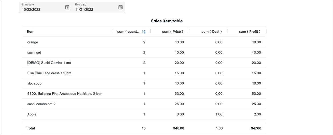
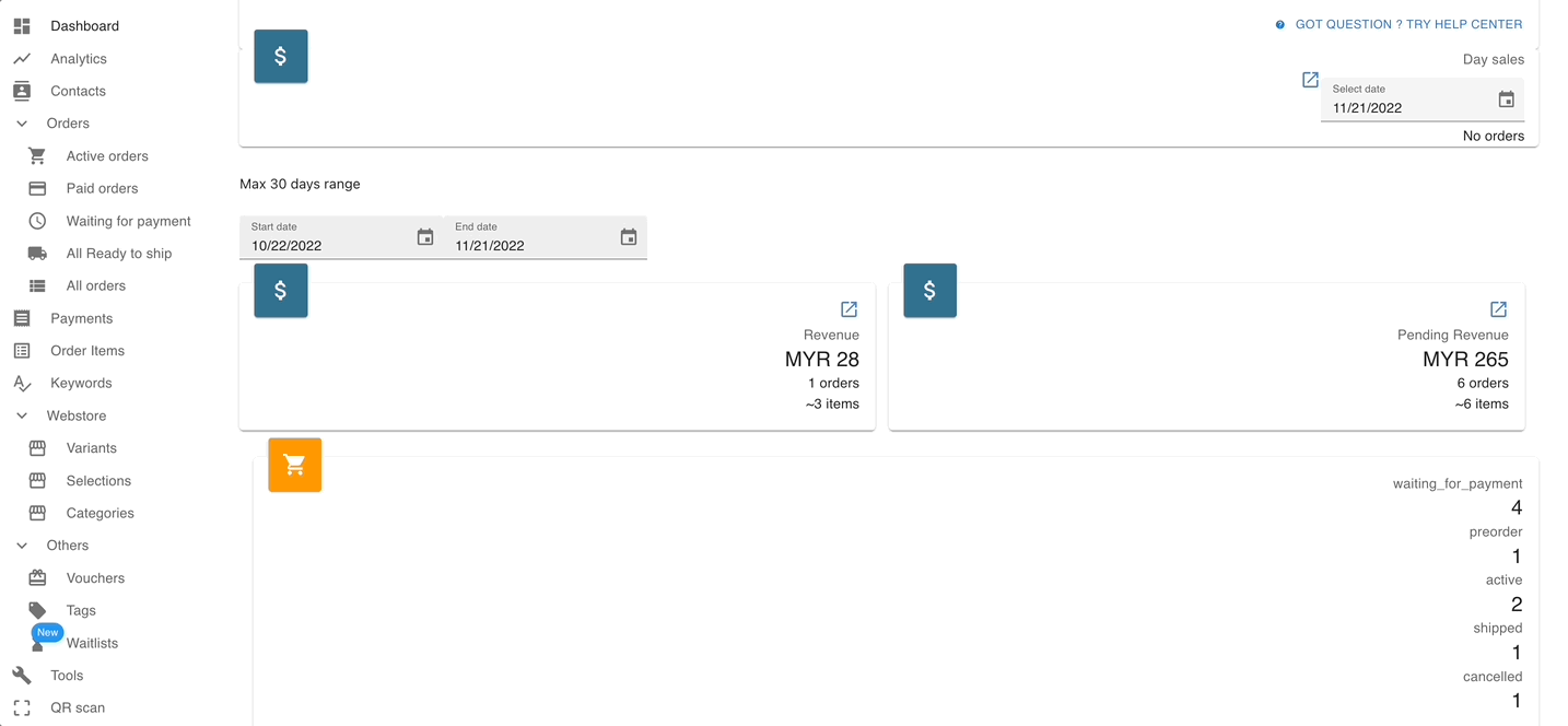
🔹 Revenue Section
Revenue (Day)
Shows total payments received per day (including shipping if paid).
This graph is based on reconciled payments — not simply orders created.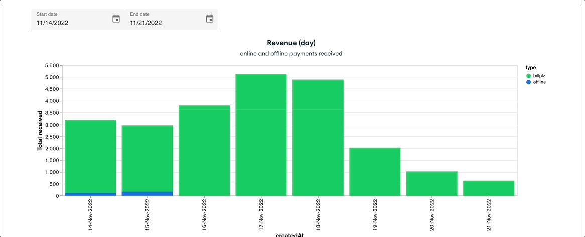
Revenue (Sum)
Shows total revenue within the selected period.
Business question you can answer:
💰 How much revenue did we actually collect this month?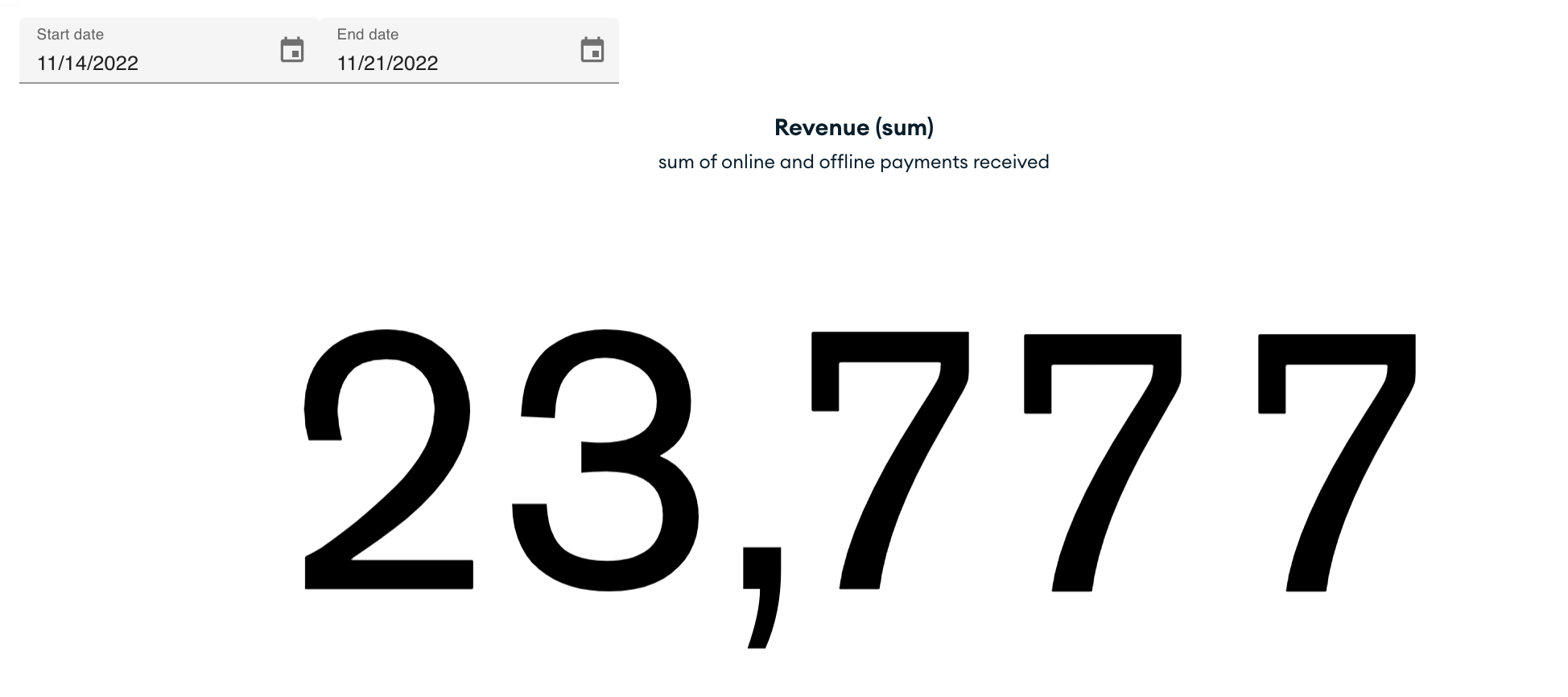
- You can have a glance at the total revenue from the selected date range in this section.
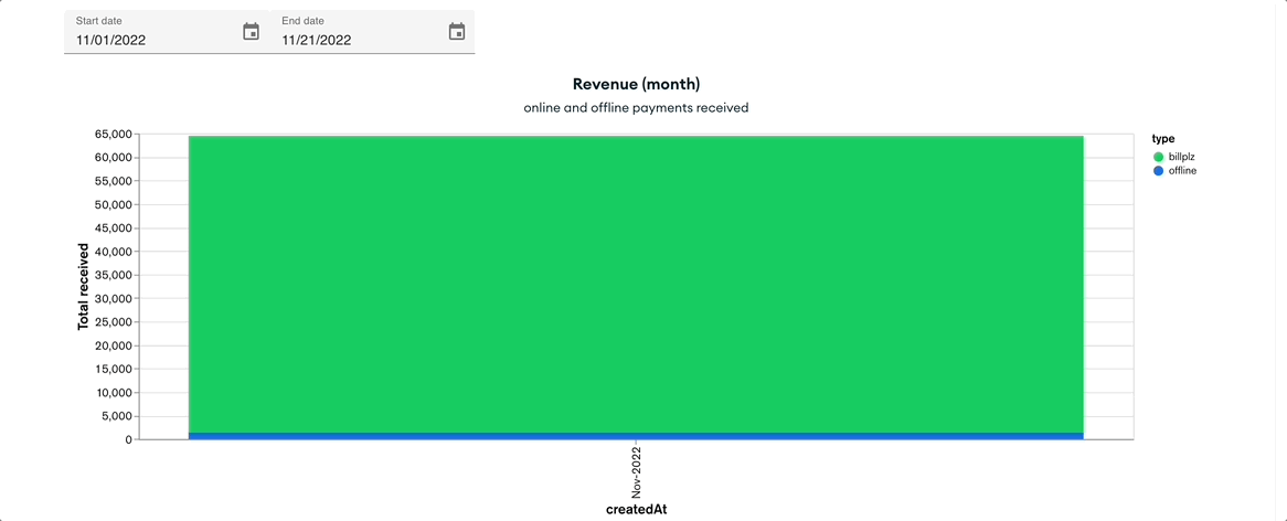
🔹 Monthly View
Monthly Revenue Summary
Shows month-to-month revenue performance.
Use this to observe longer-term trends or seasonal patterns.
4️⃣ How to Use These Insights
Analytics are not just numbers — they inform decisions such as:
📌 Increasing stock before high sales days
📌 Adjusting payment options if offline payments dominate
📌 Following up on unreconciled payments
📌 Planning marketing based on sales cycles
5️⃣ Tips & Best Practices
⭐ If your revenue graph looks lower than expected, check your payment reconciliation status.
⭐ Use monthly trends to plan promotions or restock calendars.
⭐ Compare sales and revenue to identify gaps between orders and actual collected income.
6️⃣ Common Questions Merchants Ask
🔹 Why does revenue sometimes differ from sales?
→ Because the Sales chart is based on sold items, while the Revenue graph is based on confirmed payments and reconciliation, not just order creation. (See also: About Revenue / Pending Revenue)
Summary
Analytics in Boxify is more than visual charts — it’s your strategic tool to:
📍 Track performance trends
📍 Understand customer payment behavior
📍 Spot days or months of peak demand
📍 Improve business decision-making